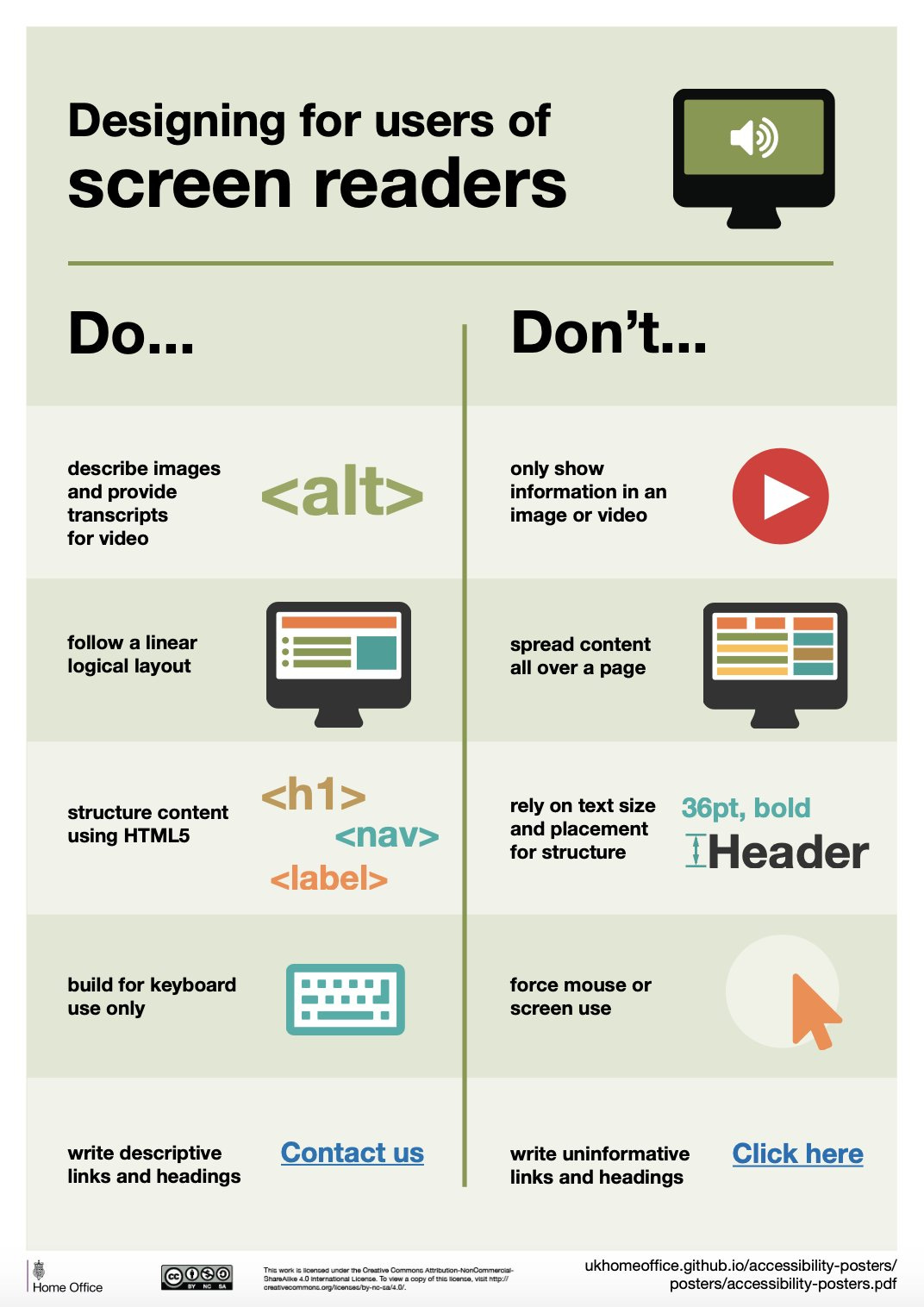
Although these infographics from the UK Home Office are not new, I thought they were worth sharing because they address the needs of different viewers, encouraging us as we create content to think about how our specific audience will receive it:
[The posters] are meant to be general guidance as opposed to being overly prescriptive. Using bright contrast was advised for some (such as those with low vision) although some users on the autistic spectrum would prefer differently. Where advice seems contradictory, it’s always worth testing your designs with users to find the right balance, making compromises that best suit the users’ needs.
They offer a set of accessible PDFs and versions in multiple languages.
Eid Mubarak & Iyi Bayramlar!
Past Tech Thursdays
Student engagement: Climer cards / Digital exit tickets / Interactive quizzing / Online question management for classes & presentations / Wheel of Names (random name generator) / Providing audio feedback
Health: Two programs to reduce eyestrain
Zoom: Screen share in Zoom / How to Zoom in in Zoom
Research: Managing references / Find free versions of articles / Text Capture Apps
Using images: Extract text from images / Remove distracting backgrounds from photos / Using screenshots
Google: “Publish” from Google Drive / Google Classroom updates / “Make a copy” function in Google Drive / Working in shared Google docs / Collaborating in Google Slides / Turn Google Forms into a formatted document
Canvas: Canvas “What-if” grades
Productivity: Study Skills Videos / Keeping Notes on Students / Keyboard shortcuts / Text Expanders / Mailbird email program / Voice-to-text options / Custom URLs & QR codes / DropBox Paper for collaboration


